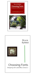
Yesterday, I managed to spent the entire day getting ready the first excerpt from Designing with LibreOffice for separate publication. It’s to be called Choosing Fonts, and consists of chapter 4 and a couple of appendices, running to no more than 50 pages all told. I added an index for it, and designed the front cover and interior title page.
At first, I was going to have the cover and title page differ from Designing with LibreOffice only in the text and perhaps the image on the cover. However, I got ambitious, and decided that each excerpt will have a different color in the cover. I chose red for Choosing Fonts, and then realized that I could use a shot of a window with a cherry wood frame at the Sun Yat-Sen Garden for the title page.
I juggled the size of the lettering and the order of lines a bit, and I am very pleased with the result. The excerpts will have a unified look and feel, but each will be different in the details.
I still have to revise and proofread the text, but Choosing Fonts should be ready to pass along to my editor by the end of May. The changes made to Choosing Fonts will find their way into the next edition of Designing with LibreOffice.


