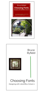
Friends of OpenDocument has released Choosing Fonts, the first of five excerpts from Bruce Byfield’s Designing with LibreOffice.
Like Designing with LibreOffice, Choosing Fonts is available as a free download from https://designingwithlibreoffice.com/download-buy/. Hardcopy versions will be available shortly.
In the five months since its release in March 2016, Designing with LibreOffice has had over 16,000 downloads. “That’s more than I could ever have imagined,” Byfield says. “However, its five hundred pages are more than many people want to read. Often, they just want information on a very specific topic. Excerpts like Choosing Fonts are a way to make the information in the complete book more accessible.”
As the title suggests, Choosing Fonts is about the considerations that go into choosing fonts. Topics include matching fonts, the availability of free-licensed fonts, determining line spacing, and how the selection of fonts can guide other design considerations from paragraph indentations to page margins.
Future excerpts will be:
- Styles and Templates
- Character and Paragraph Styles
- Frame, List, and Page Styles
- Slide Shows, Drawing, and Spreadsheets
All excerpts, including Choosing Fonts, contain the latest revisions to Designing with LibreOffice, including indexes and suggestions from the French translation team.
For more information, please contact bruce@designingwithlibreoffice.com or Jean@designingwithlibreoffice.com.


